My Role: Senior Product Designer, UI/UX Team Leader/Manager
Project Areas: User Research, Interaction, Visual design, Prototyping & Testing
Project Date: January 2019-Current
Overview
The Joint Training Tool (JTT) is a new, web-based platform developed for the DoD Joint Chiefs of Staff to streamline the planning, coordination, and assessment of joint military training exercises. Previously, users had to navigate multiple disconnected tools and manual processes to manage training data. As the first UX designer on the project, I was responsible for defining a unified user experience from the ground up—bringing structure, usability, and consistency to a mission-critical environment that lacked centralized support for its workflows.
Challenge
There was no centralized tool for managing joint training activities—users relied on a patchwork of disconnected systems, spreadsheets, and manual processes. This fragmented ecosystem created inconsistencies, data silos, version control issues, and operational inefficiencies. The challenge was to design a cohesive, user-centered platform from the ground up that could unify workflows, streamline communication, and support the complex coordination needs of joint military training—within the constraints of a highly secure and bureaucratic environment.
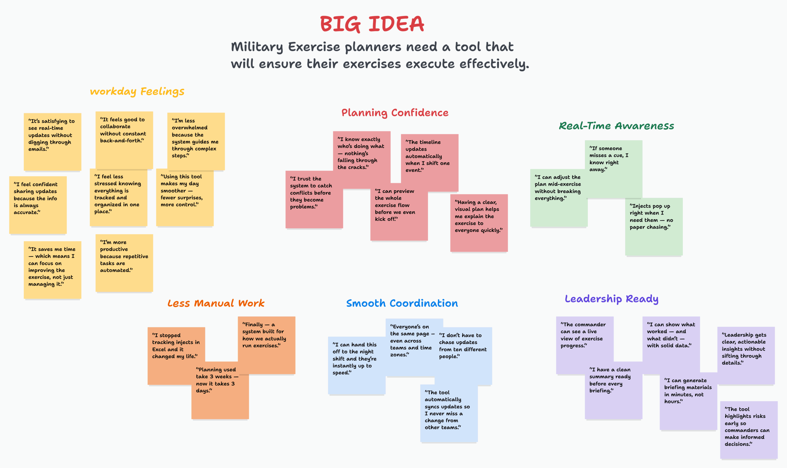
User Research
To ground the design of the Joint Training Tool in real user needs, I conducted in-depth user interviews and facilitated collaborative workshops with military and civilian personnel. Through exercises like empathy mapping, defining user needs, and generating “big ideas,” we uncovered key pain points and priorities across roles. These insights helped shape the foundation of the tool’s functionality, ensuring it supported real-world workflows and addressed gaps created by the previously fragmented systems.
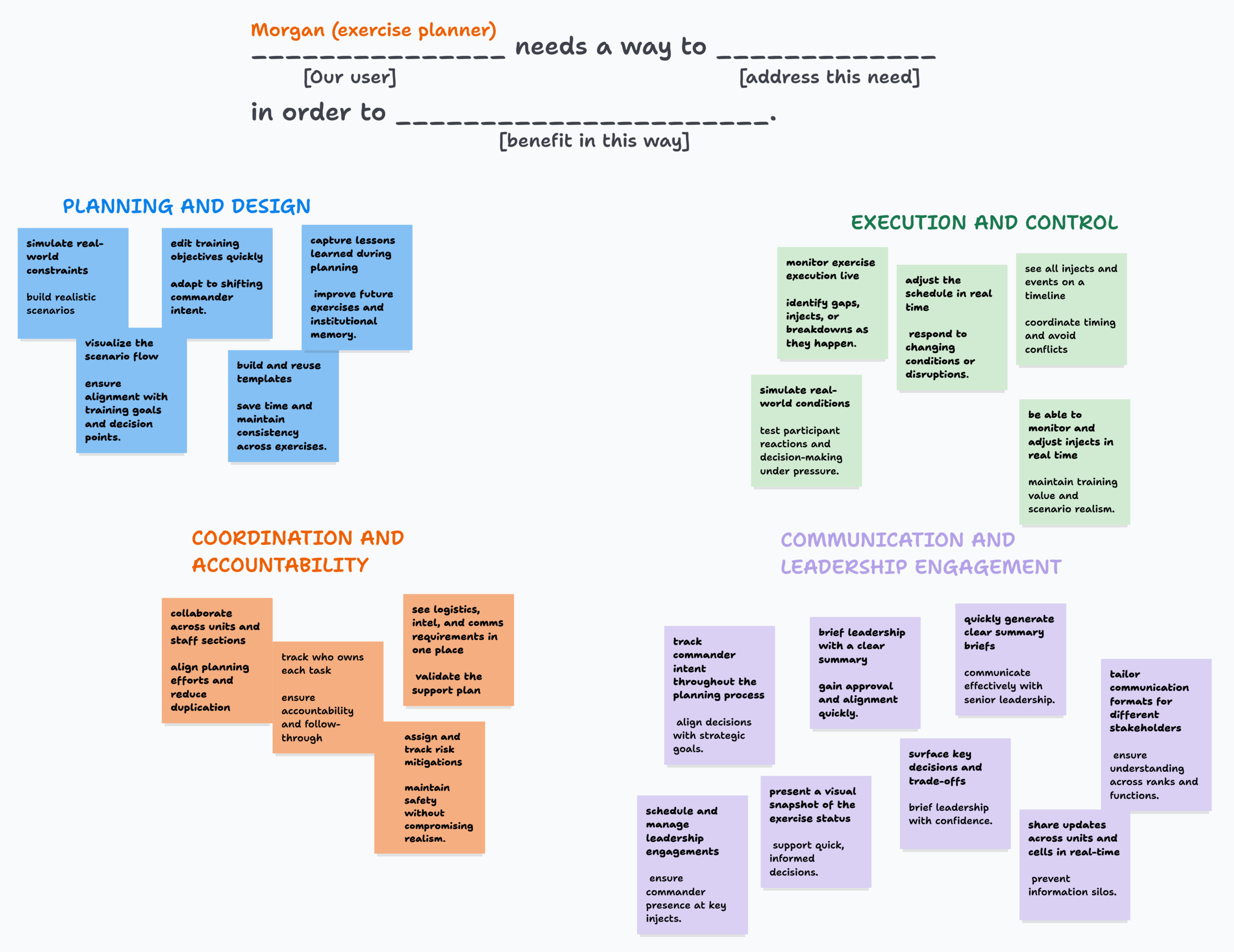

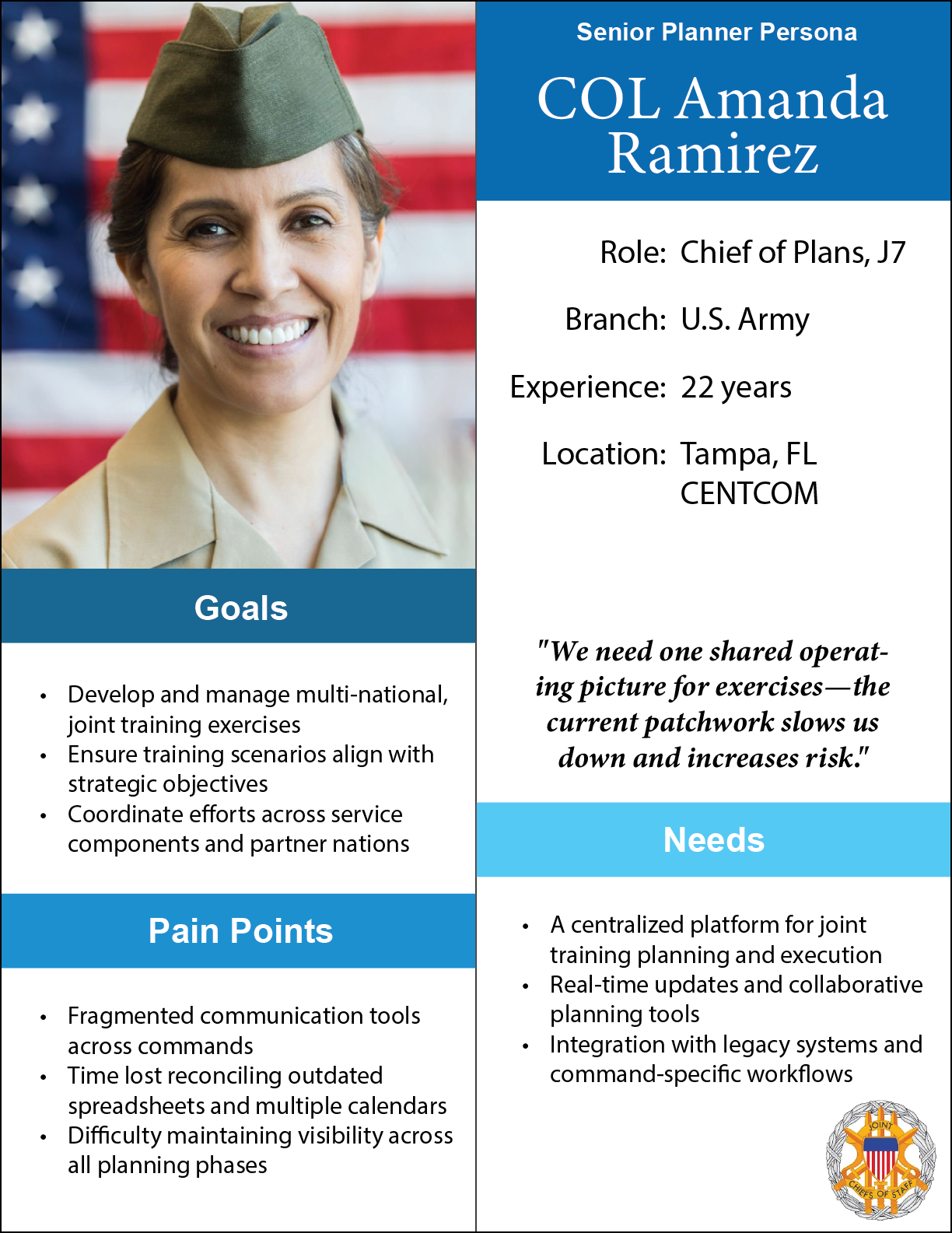
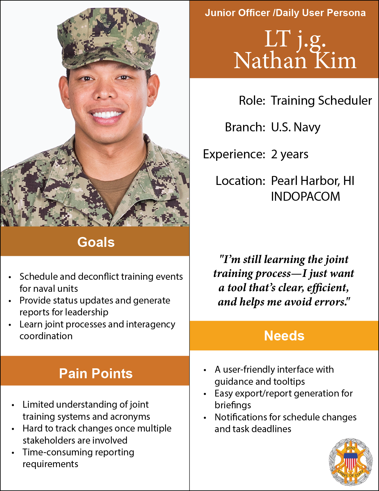
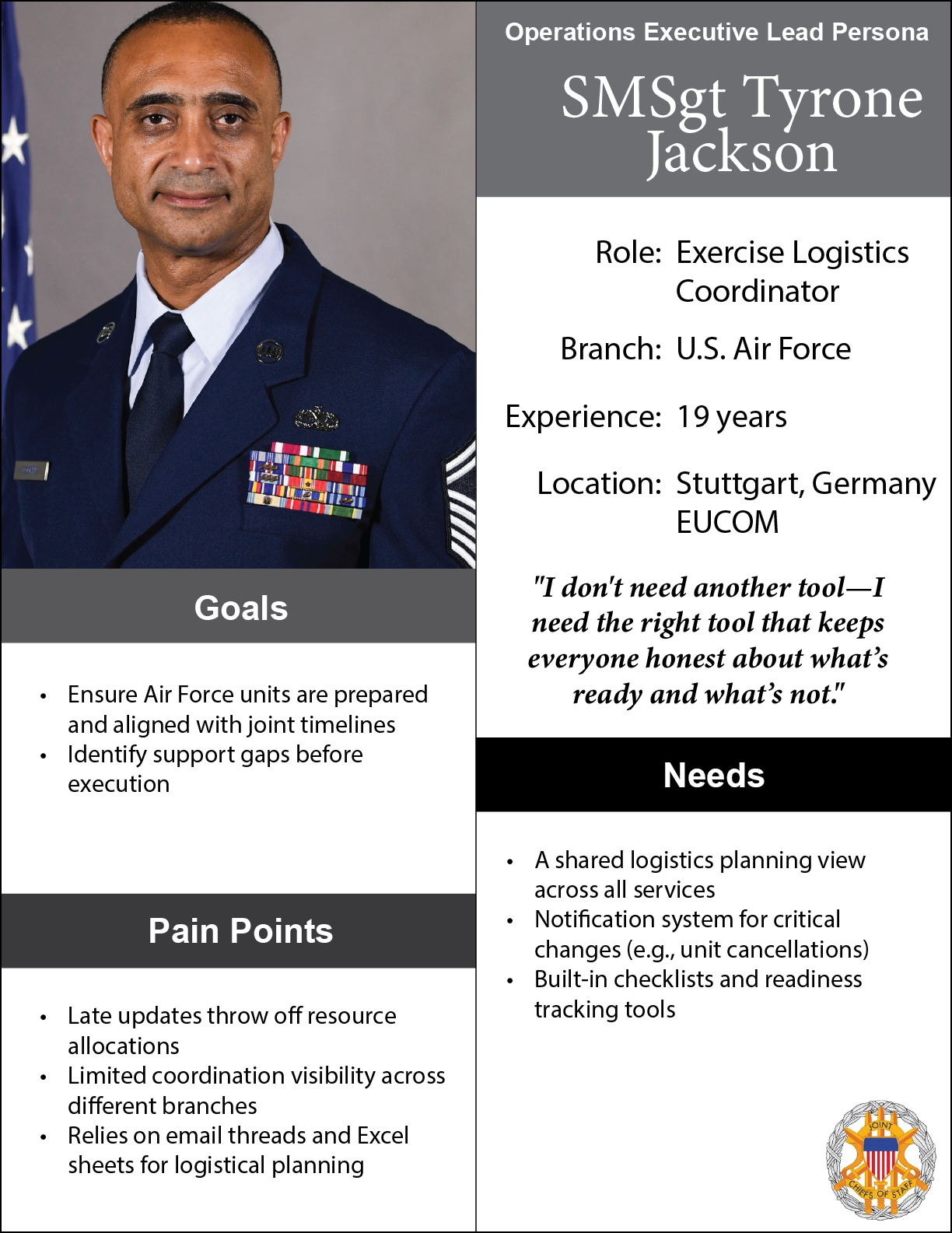
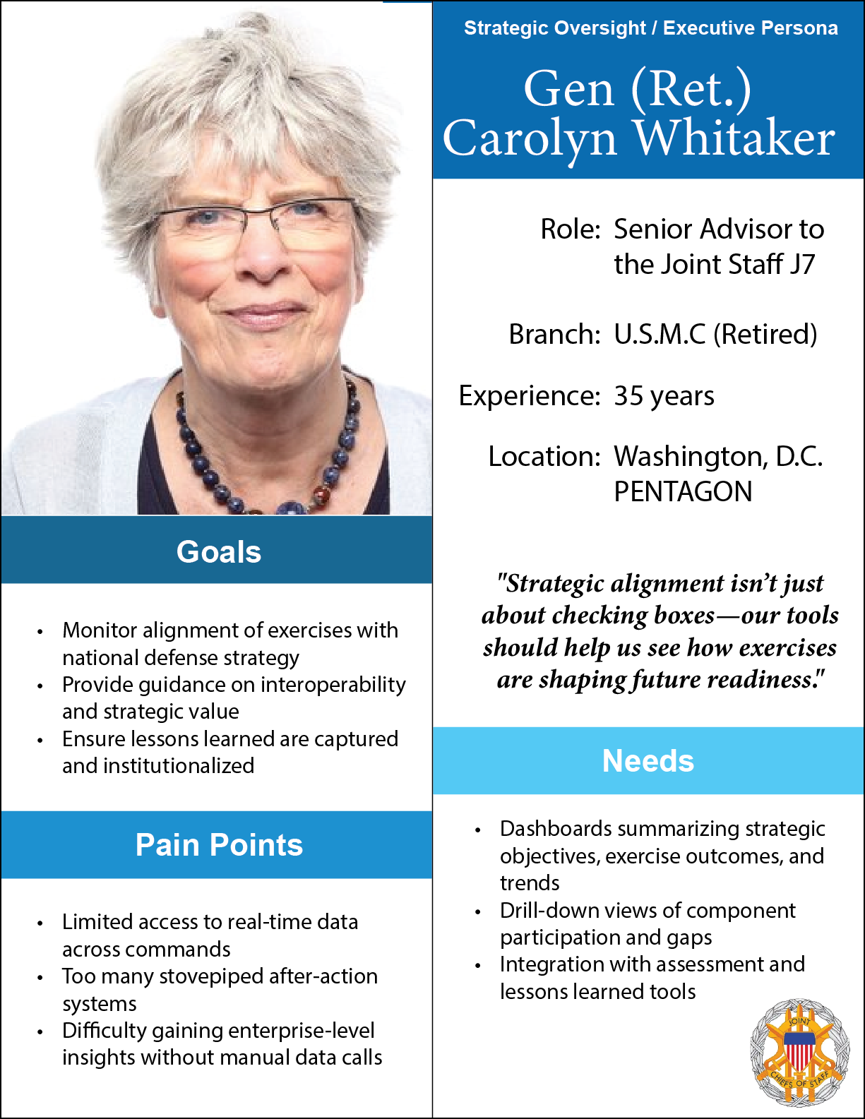
User Personas
Based on my research, I developed detailed user personas to represent key stakeholders in the joint training ecosystem. These included Col. Amanda Ramirez, a strategic planner focused on mission alignment; Lt. j.g. Nathan Kim, a junior officer managing daily coordination tasks; SMSgt Tyrone Jackson, an operations lead with deep institutional knowledge; and Gen. Carolyn Whitaker, a senior decision-maker requiring high-level visibility and reporting. These personas helped guide design decisions and ensured we stayed aligned with real user goals throughout the project.
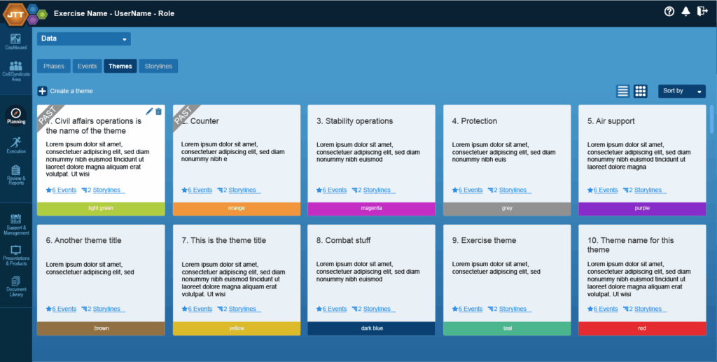
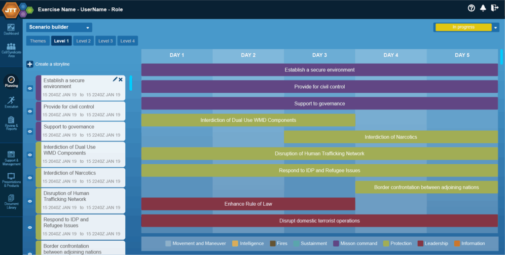
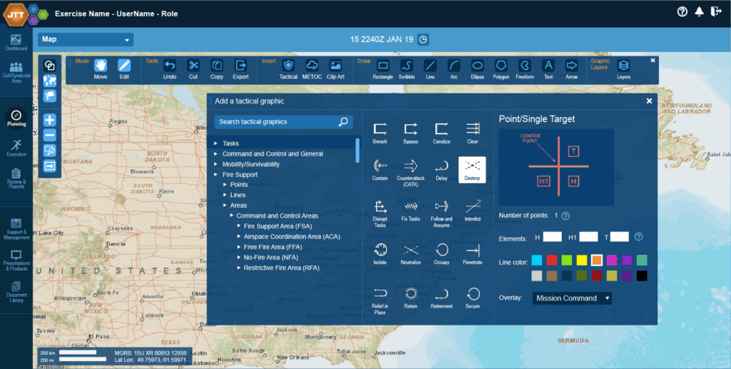
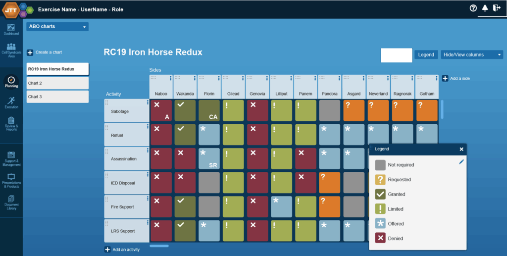
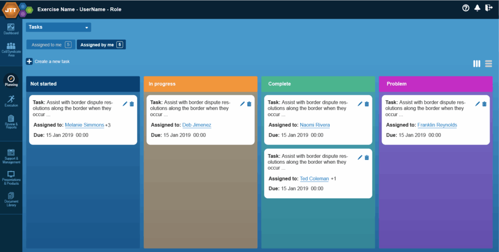
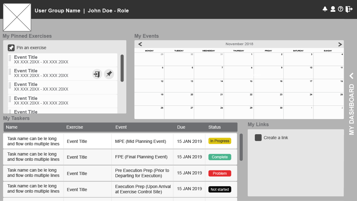
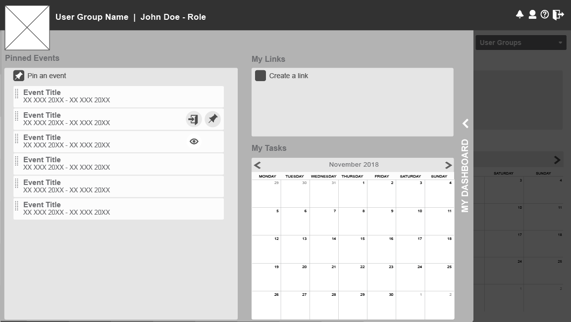
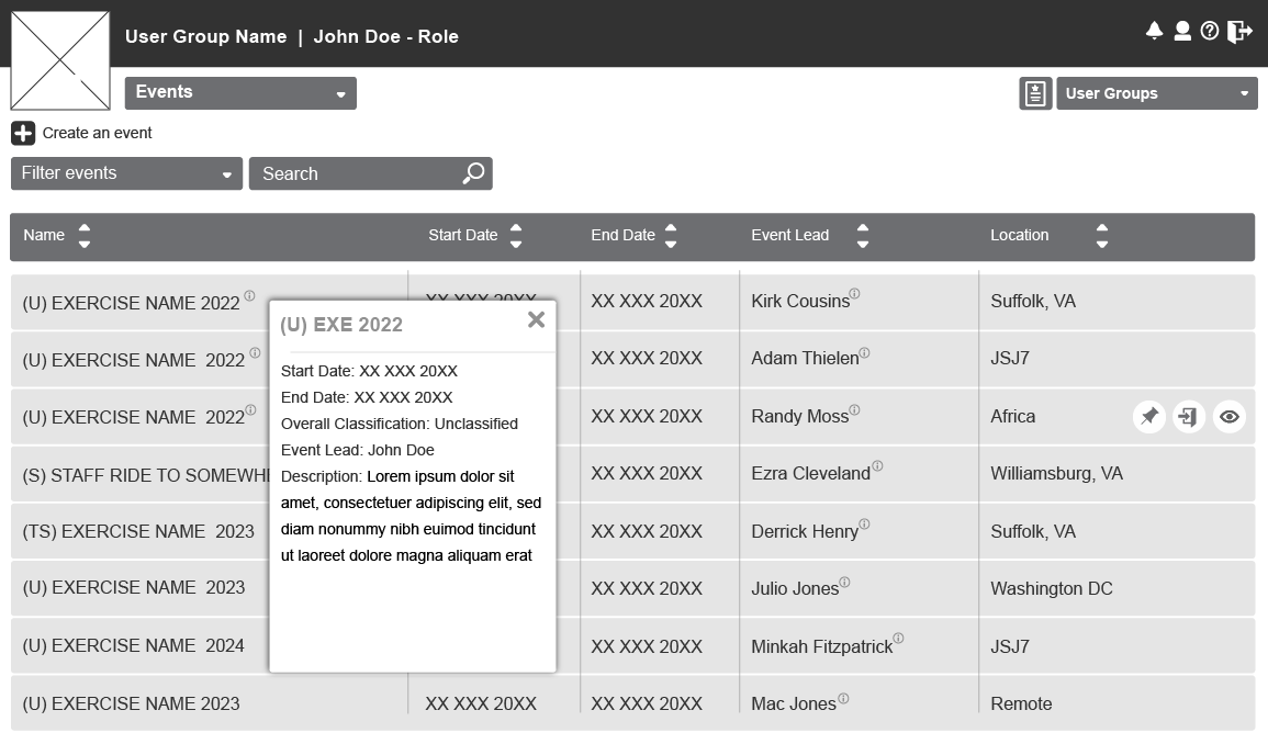
Sketches and Wireframes
With clear insights from user research and defined personas, we moved into the design phase—starting with low-fidelity wireframes and storyboards to visualize key workflows. These early concepts helped us explore layout, navigation, and system logic collaboratively with stakeholders. From there, we developed interactive prototypes to test core functionality and gather feedback quickly, ensuring the evolving design stayed aligned with user expectations and operational needs.

Usability Testing and Ongoing Enhancement
To evaluate and refine the interface, we conducted moderated usability testing sessions with active and retired Joint Warfighters. Our goal was to identify usability pain points that hindered task completion and user confidence.
Methods Used:
• Scenario-based task testing (involving key workflows such as mission setup and after-action review)
• Think-aloud protocol to understand user reasoning
• SUS (System Usability Scale) scoring for benchmarking
• Post-test interviews for qualitative feedback
Participants:
8 users across Army, Navy, and Air Force branches
Varied ranks and tech familiarity to capture a broad spectrum of user needs
Key Findings
• Navigation Confusion: Users struggled with understanding the system’s information architecture; core functions were buried or labeled in unfamiliar jargon.
• Inconsistent Feedback: Lack of system response after actions (e.g., form submissions) led users to repeat tasks unnecessarily.
• High Cognitive Load: Users expressed feeling overwhelmed by the dense interface and the number of simultaneous options.
Improvements Made
• Streamlined Navigation: Simplified and restructured the navigation based on card sorting and tree testing results.
• Clear System Feedback: Introduced confirmation messages, loading indicators, and subtle animations for state changes.
• Reduced Interface Clutter: Applied progressive disclosure principles to show only what’s necessary at each stage of the workflow.
Takeaways
• User Empathy is Critical: Working with warfighters reminded me that users often operate under stress—design must support focus and speed.
• Terminology Matters: Military users (even specific to their branch of the military) have a distinct lexicon; aligning UI language with their expectations significantly improved task success.
• Iterate with Real Users: Even small UI changes can have outsized effects on performance and trust when validated with real users in context.
Hi fi and Comps